Getting Started with CSS.
This article provides an in-depth knowledge on all CSS properties that you need to know to get started building projects. (CSS CheatSheet)


Introduction
Cascading Style Sheets, fondly referred to as CSS, is a simply designed language intended to simplify the process of making web pages presentable. It allows us to apply styles to web pages. More importantly, CSS enables us to do this independent of the HTML that makes up each web page. It describes how a webpage should look: it prescribes colors, fonts, spacing, and much more. In short, we can make your website look however you want. CSS lets developers and designers define how it behaves, including how elements are positioned in the browser.
While HTML uses tags, CSS uses rulesets. CSS is easy to learn and understand, but it provides powerful control over the presentation of an HTML document.
Why use CSS?
CSS saves time: You can write CSS once and reuse the same sheet in multiple HTML pages.
Easy Maintenance: To make a global change simply change the style, and all elements in all the webpages will be updated automatically.
Search Engines: CSS is considered a clean coding technique, which means search engines won’t have to struggle to “read” its content.
Superior styles to HTML: CSS has a much wider array of attributes than HTML, so you can give a far better look to your HTML page in comparison to HTML attributes.
Offline Browsing: CSS can store web applications locally with the help of an offline cache. Using this we can view offline websites.
CSS Properties
A CSS property assign a style or behavior to an HTML element. Examples include: color, border, margin, font-style, and transform.
Font Property
The font properties allow you to change the look and style of the font. There are many font properties in CSS which are mentioned below.
- Font-Family: It changes the font family of specified words, paragraphs and sentences.
font-family: 'Segoe UI', Tahoma, Geneva, Verdana, sans-serif;
- Font-Style: Used to change the text to normal, oblique, and italics.
font-style: oblique;
- Font-size: It is used to modify the size of the displayed font.
font-size: larger;
- Font-Weight: It is used to determine the weight of the font.
font-weight: normal;
- Font-Variant: It is used to display font in normal or small-caps.
font-variant: small-caps;
- Font: Shorthand Property.
font: font-style font-variant font-weight font-size font-family;
Text Property
Text formatting properties are operated to design and style text by forming their alignment, spacing, etc. as per requirement.
- Letter-Spacing: Used to specify space between the characters of the text.
letter-spacing: 0.1em;
- Word-Spacing: It represents an additional amount of space between words.
word-spacing: 0.4em;
- Text-decoration: Used to add or remove text-decorations like underline, overline, line-through, or none.
text-decoration: underline;
- Color: Used to set the color of the text.
color: cyan;
- Text-Alignment: Used to set the horizontal alignment of the text.
text-align: left;
- Text-Transform: Permits for capitalizing the first letter of each word, capitalizing all letters of a word, using all small letters in each word, and the initial value.
text-transform: capitalize;
- Text-Decoration: It Allows text to be decorated by the properties like underline, overline, line-through, blink, and none.
text-decoration: none;
- Text-indent: Used to specify the amount of indentation.
text-indent: 3em;
- Text-indent: The text-shadow property is used to add shadow to the text.
text-shadow: horizontal -shadow vertical-shadow blur-radius color|
Background Property
Background properties are used to style the background and define the background effects for elements.
- Background-Image: Sets the background image of an element.
background-image: url("clashingcode");
- Background-Position: The position property is mainly used to specify the positioning of the image.
background-position: right-top;
- Background-Repeat: Defines how a specified background image is repeated. The repeat-x value will repeat the image horizontally(x-axis) while the repeat-y value will repeat the image vertically(y-axis).
background-repeat: repeat-x;
- Background-Attachment: specifies the kind of attachment of the background image(scroll with the content or be fixed respect the container).
background-attachment: scroll;
- Background-Color: Sets the background color of an element.
background-color: blue;
- Background: Shorthand Property.
background: background-color background-image background-repeat background-attachment background-position;
Border Property
Border properties allow you to specify how the border of the box representing an element should look.
- Border-Color: Used to set the color of an element's border.
border-color: black;
- Border-Style: Allows you to set the style of a border - none, dotted, dashed, solid, or double.
border-style: dotted;
- Border-Radius: Allows you to add rounded corners to the div.
border-radius: 15px;
- Border-Width: Used to set the width of an element's border.
border-width: 20%;
- Border: Shorthand Property.
border: 10px, red, double;
Box Model and Classification Property
In an ordinary sense, the CSS box model is a container that wraps around every HTML element consisting of the border, padding, margin and content.
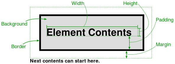
There are several properties in CSS that are often grouped together as box properties which control the way browsers lay out the page using the CSS box model.
- Margin: Sets the margin as top, left, bottom, or right.
margin: top right bottom left;
- Padding: Sets the padding as top, left, bottom or right.
padding: top right bottom left;
- Width: Sets an element's width as absolute units or auto.
width: auto;
- Height: Sets an element's height as absolute units or as auto.
height: auto;
- Overflow: Specifies what should happen if content overflows an element's box.
overflow: hidden;
- Visibility: Switches of the visibility of the element but the space occupied.
visibility: visible;
- Display: It defines how elements are displayed on the web page.
display: block;
- Float: Allows text to wrap around an element.
float: none;
- Position: It specifies the positioning method of the HTML entity on the web page.
position: sticky;
Table Property
Table properties are used to give style to the tables in the document.
- Border-collapse: The border-collapse property sets whether the table borders should be collapsed into a single border:
border-collapse: separate;
- Empty-cells: Used to show or hide borders and background of table cells that have no visible content.
empty-cells: show;
- Caption Side: The caption side property is used for controlling the placement of the caption in the table. By default, captions are placed above the table.
caption-side: top;
Animation Property
Animations allow one to animate transitions or other media files on the the web page.
- Animation-name: Specifies the name of the keyframe.
animation-name: clashing;
- Animation-duration: Defines how the time is taken for the execution of animation.
animation-duration: 10s;
- Animation-timing-function: Specifies the speed of the animation.
animation-timing-function: ease;
- Animation-delay: Specifies a delay before the animation will start.
animation-delay: 5ms;
- Animation-iteration-count: Determines how many times an animation should be played.
animation-iteration-count: 3;
- Animation-direction: Determines the play direction of animation (i.e., alternate or reverse).
animation-direction: normal;
- Animation-fil-mode: Determines what values are applied by the animation outside the time it is executing.
animation-fill-mode: both;
- Animation: Shorthand Property. It is a shorthand for animation-name, animation-duration, animation-timing-function, animation-delay, animation-iteration-count, animation-direction, animation-fill-mode, and animation-play-state.
animation: 4s linear 0s infinite alternate;
Transition Property
Allows you to change property values smoothly, over a given duration.
- Transition-delay: The transition-delay property specifies a delay (in seconds) for the transition effect.
transition-delay: 1s;
- Transition-duration: Determines how many seconds or milliseconds a transition effect takes to complete
transition-duration: 2s;
- Transition-timing-function: This property allows a transition effect to change speed over its duration.
transition-timing-function: linear;
- Transition-property: Specifies the name of the CSS property the transition effect is for.
transition-property: none;
- Transition: Shorthand Property. The transition property is a shorthand property for: transition-property transition-duration transition-timing-function transition-delay.
transition: all 4s ease-in-out 1s;
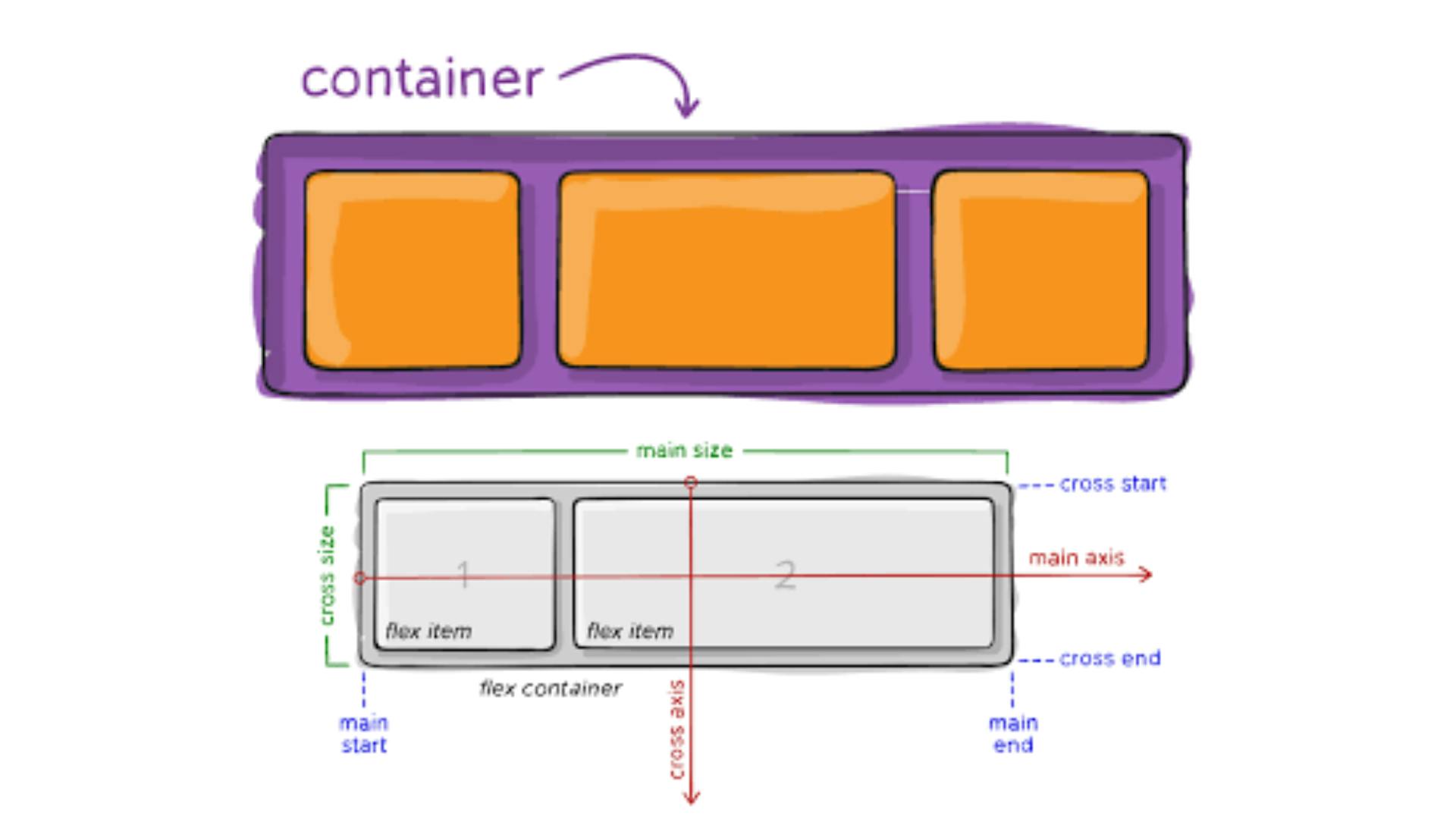
Flexbox
Flexbox is a one-dimensional layout method for laying out items in rows or columns. Flexbox makes it simple to align items vertically and horizontally using rows and columns.
- Display: It enables a flex container; inline or block.
display: flex;
- Flex-direction: Determines the direction of the items.
flex-direction: row;
- Flex-wrap: Determines whether the flex items should wrap or not.
flex-wrap: wrap;
- Justify-content: This property is used to align the flex items. flex-wrap: nowrap;
justify-content: flex-start;
- Align-items: Determines the behavior for how flex items are laid out along the cross-axis on the current line.
align-items: flex-start;
- Align-content: Specifies the distribution of space between and around content items along a flexbox's cross-axis.
align-content: flex-start
- Order: It is used to control the order in which flex items appear in the flex container.
order: 1;
- Flex-grow: It allows representing the ability of a flex-item to grow by your choice.
flex-grow: 1;
- Flex-basis: This defines the default size of an element before the remaining space is distributed.
flex-basis: 50%;
- Flex-shrink: Defines the ability for a flex item to shrink.
flex-shrink: 3;
- Align-self: Sets the alignment for individual items.
align-self: flex-start;
CSS Grid
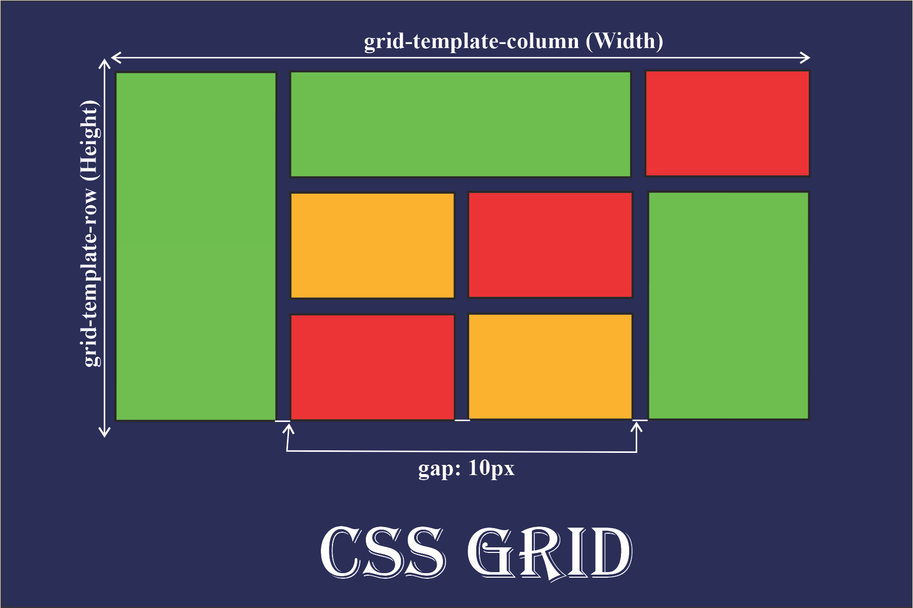
Grid layout is a 2-Dimensional grid system to CSS which helps to design complex responsive web design easily and effectively.
- Display-grid: When the display property is set to grid the container turn ups to the grid.
display: grid;
- Grid-template-areas: Determines how to display columns and rows, using named grid items.
grid-template-areas: "myArea myArea . . .";
- Grid-column-gap: Defines the gap between the columns.
grid-column-gap: 50px;
- grid-row-gap: Specifies the size of the gap between rows.
grid-row-gap: 50px;
- Grid-template-columns: It defines how many columns there should be in a grid layout.
grid-template-columns: auto auto auto auto;
- Grid-template-rows: Similar to grid-template-columns, The grid-template-rows property specifies the number of rows in a grid layout.
grid-template-rows: 10px 30px;
- Grid-auto-columns: The grid-auto-columns property specifies a size for the columns in a grid container.
grid-auto-columns: 50px;
- Grid-auto-rows: Put a default size for the rows in a grid.
grid-auto-rows: 250px;
- Grid-auto-flow: The grid-auto-flow property directs how auto-placed items get inserted.
grid-auto-flow: column;
- Place-content: The place-content property allows you to align both justify-content and align content.
place-content: align-content / justify-content ;
- Grid-column-start: Defines where to start the grid item.
grid-column-start: 4;
- Grid-column-end: On which column line the item will end.
grid-column-end: span 2;
- Grid-row-start: This property specifies on which row line the item will start.
grid-row-start: 2;
- Grid-row-end: On which row line the item will end.
grid-row-end: span 1;
Conclusion
Congratulations! You've made it to the end! By now, you have learned a lot about CSS, and hopefully you feel more comfortable working with it than you did before.
You might be wondering where you can go from here. One of the best ways to learn is to learn by doing: try out your new CSS skills by building a website of your own.
Happy Coding.